In an ideal world, if you scan a photo and then print it, you could expect it to look the same. Of course, that’s not the case with consumer hardware. What’s on the screen, printed, and scanned, never quite matches up. But, there’s no reason for it to be impossible! The only real physical limit is the whiteness of your paper, and the darkness of your ink.
Color spaces are in fact very well defined. A specific color value is by definition always and forever going to be exactly that same color, given the same lighting conditions.
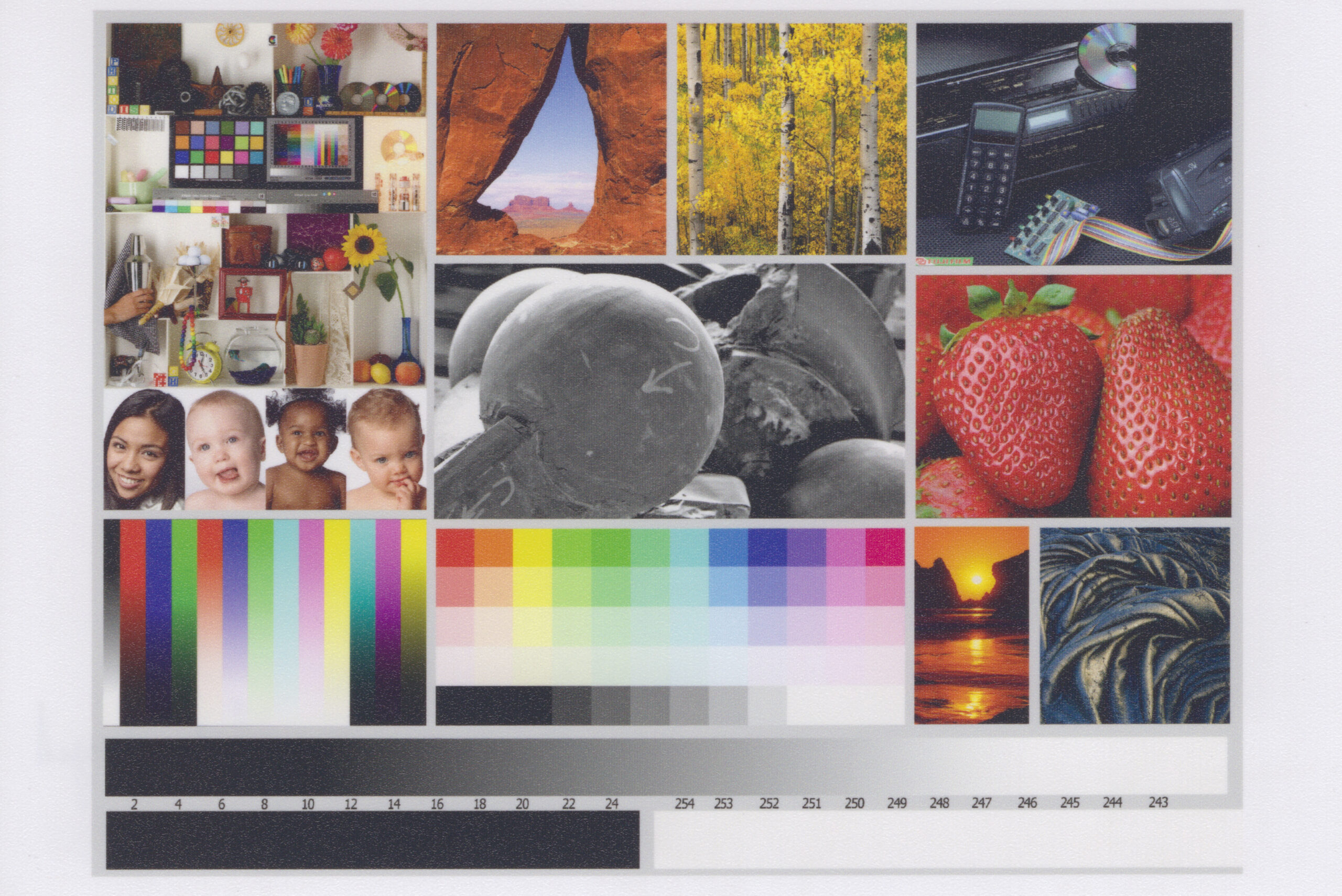
Just to ease any doubts, without delay here’s my final calibration result:

Source image in the top-left, the printed photo below, and a scan of the printed photo on the right.
All you need to reasonably calibrate a printer is a scanner. However, your calibration will only be as good as your scanner’s factory calibration. (Calibrating the scanner yourself is possible too, of course, but may not be necessary for acceptable results.) At the very least you need to be able to disable all automatic adjustments in the scanner software, and specify the scanner’s color space. And the scan should honor those color spaces. The sRGB or Adobe RGB targets are what you should be looking for.
On an EPSON Perfection v39, a budget scanner, it will look something like this:

If your scanner model has a decent reputation, and your scanned image looks color correct, then you should be good. Make sure to set your monitor to sRGB or any appropriate calibration to ensure a good comparison. A monitor with a good reputation regarding its factory calibration is nice to have as well.
For comparison, here’s a book cover scanned at 1200dpi (the JPG is downscaled here) using a multi-function Brother DCP-T500W on the left, and using an EPSON Perfection v39 on the right. The Brother is also the printer which I’m calibrating, and I’m not that inclined to accept its scans as correct, for several reasons.

Brother DCP-T500W 
EPSON Perfection V39


The lighter colors in the Brother scan are much too saturated and brightened. Skin tones tend to bright yellow, blues are going cyan, and the bright red icon is washed out. This scanner actually does not seem to specify any color space. In the EPSON scan on the right, the colors and contrast closely match the reality of the book cover in front of me. What I see on my screen (which also claims to be sRGB) matches with what’s scanned, so I’m inclined to believe that my monitor and scanner both have a reasonable factory calibration. It matches my expectations. And that’s all what’s needed. A scanner that can promise to scan in a requested color space, and delivers what it’s asked. Automatic enhancements are useless here, they are unpredictable. If I can calibrate my prints to the EPSON scanner, at the very least the prints will also match my expectations.
Important to note, white paper isn’t white. White paper is white-paper color, which is darker than monitor white (which is D65 white). Most regular paper will be slightly blueish (to make it look whiter, and also tends to look like whichever color of light you happen shine at it). Office scanners, such as the Brother multi-function may brighten up scans to make generic paper white match monitor white. This is handy for documents, this is not good for photos or calibration purposes.
Here’s a sample image, along with a scan, printed on the default best quality photo settings (both in sRGB color space here, printed on the Brother, scanned on the EPSON):


It looks a bit dull.
The details, all light colors and black colors, are fully reproduced, but the contrast is rather low, and some of the colors are off. This is not because scans are dull. You may be tempted to “correct” and “enhance” scans, but this scan isn’t actually wrong. The white of a display is simply brighter by definition that the white of paper, and similarly, a display’s black is deeper than the black of printer ink. Your prints should simply not be using the unprintable color space, and that’s where good photo editing can really make a world of difference.
Clearly the printer’s factory settings are stretching the input contrast into the printable range. It’s definitely a very safe and well-designed calibration for easy out-of-the-box printing — unedited photos with bad lighting will print quite well. Dark and light details won’t get lost. Evidently, the defaults here don’t attempt to accurately reproduce the actual color space as it’s defined, but we can change that.
My first attempt at getting better output was to simply let Photoshop manage the color space, and print in CMYK using the FOGRA39 profile using absolute colorimetric mode (after comparing several other standard CMYK profiles.)

The result feels like it’s already a milestone ahead of the factory calibration. Strawberries are edible again. Contrast looks great. Light and dark extremes are clipped off, as expected however. Unfortunately this profile failed on several photos with extreme blue and black colors — dark blue turned darker than black, and saturation varied wildly.
I printed a chart with manual CMYK values. Based on the scan, the cyan mismatches with FOGRA39 standard cyan, measuring a bit too magenta. The magenta and yellow are on point. I created a custom CMYK profile in Photoshop, based on the following chart, which visibly improved the color spectrum.
However, darker blacks now went completely haywire. Then I noticed that the color-mixed CMY black sample on the bottom-left of the chart looked a bit too much like the real black ink sample on top of the chart. I manually printed the color layers to produce the bottom-right sample.
Very different. And also a much deeper black.
Turns out most common inkjet printers only accept RGB data, converting that to CMYK space internally. Any CMYK content that’s printed is converted into RGB by the driver software, before being converted back into CMYK by the printer. So whatever gets sent as CMY black gets turned into plain black (or however the printer wants to print black).
I printed another challenging photo using the FOGRA39 profile again, this time separating all the color layers manually, and sure enough the blacks and blues came out as expected. But the saturation still didn’t look quite right yet. And printing four layers manually is quite a hassle, taking a really long time as well.
Searching for a software solution to generate RGB inkjet printer color profiles, I finally came across Argyll, which supports scanner-based calibration (but also doesn’t recommend doing it). It’s actually a large set of command line tools, so it requires reading a lot of manual pages to figure out how all the pieces that are needed work together.
Here’s what I did.
After a few attempts at calibrating on plain paper, I ended up with the following command line options which gave a reasonable result. I only used this to obtain a first reference calibration, not for printing.
targen -d2 -G -e32 -B32 -s16 -g16 -m8 -f2028 -p0.5 bro_best_3
printtarg -s -t600 -pA4R -iSS bro_best_3
scanin -c "calibrate_077.tif" bro_best_3_01.cht "AdobeRGB1998.icc" bro_best_3
scanin -ca "calibrate_078.tif" bro_best_3_02.cht "AdobeRGB1998.icc" bro_best_3
colprof -v -D"Brother Plain Best" -cmt -dpp -S "AdobeRGB1998.icc" -qh -Za -ta -Ta -r3 bro_best_3
The targen command creates a list of colors that will be printed, printtarg creates the actual files that you need to print.
Very important. You must turn off color management both under Photoshop and under your printer’s drivers. For Brother, you uncheck “Match Monitor” in the advanced options (it will say “Colour Mode: Off” in the main settings screen after you do this). Make sure your remaining print settings exactly match the print settings you want to calibrate for.

Scan the calibration sheets to Adobe RGB or sRGB. The scanin tool turns the scans into a list of measured colors. Finally, the colprof utility is what generates the actual color profile.
Using the cctiff tool, you can create the RGB image that will be sent to the printer, which you can also use to preview your color ranges.
cctiff -ia "PrinterEvaluationImage_V002_Adobe.tif" -ia "bro_best_3.icm" "PrinterEvaluationImage_V002_Adobe.tif" "PrinterEvaluationImage_V002_Adobe_bro_best_3.tif"The image below shows the output of the plain paper color profile, that is, the raw RGB values which will be sent to the printer. The colors will look weird (usually over-contrasted and -saturated), this is expected.
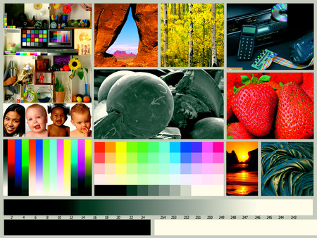
The whites are clearly compensating strongly for the paper’s blueish shade here. (You can probably calibrate prints for actual colored paper too.) Blacks are heavily clipped, because this is just a light plain paper print. That’s all fine and expected. The only issue in this calibration are the jumps in the gradients, which are caused by not having enough of the right data points (or by a low quality measurement). However, for the purpose of a first reference calibration, this is a good start. I won’t be using this profile to actually print.
A few warnings here. First. The color management in Photoshop will give different behaviour for out-of-range whites and blacks when printing than Argyll’s cctiff tool with these printing profiles. The quality of Argyll’s cctiff tool is much more accurate. You can directly print the output of cctiff using Photoshop with color management disabled, in the same way that the calibration sheets were printed. Second. Using an input file in ProPhoto color space causes an overcompensation on the white point, it will not look as expected. It’s a camera color space with brighter whites. Converting those images to Adobe RGB in absolute color space, before converting to your printer’s profile, works to get exactly what’s on your screen. (Open your ProPhoto file, convert it to Adobe RGB in absolute mode, save as TIFF, use cctiff to create the TIFF in printer color space, and print that with color management disabled.) Either Adobe RGB or sRGB input files will give the same result, but Adobe RGB has a wider input range for saturated colors, so should be preferred for scanning and print preparation if it’s available. Use sRGB for images intended for computer display.
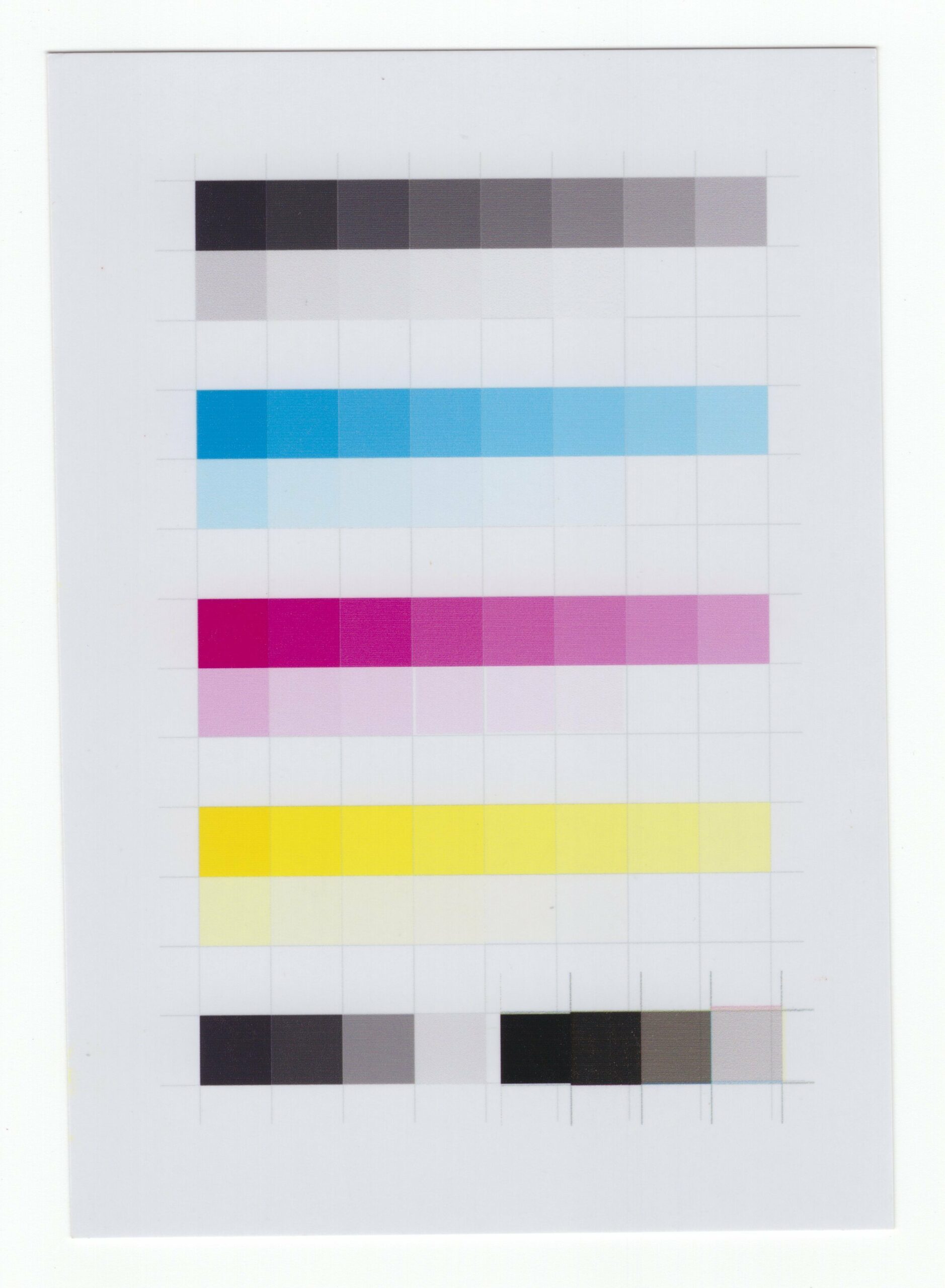
After a bit of fiddling with the settings of the calibration sheets, I ended up with the following command options for calibrating the actual photo paper. The number steps for the grayscale gradient have been increased, additional samples for the outer boundaries of the color space have been added, and three sheets are printed instead of the previous two.
targen -d2 -G -e32 -B32 -s32 -g32 -m8 -f3042 -p0.75 -c bro_best_3s.icm -n32 bro_photo
printtarg -s -t600 -pA4R -iSS bro_photo
scanin -c "calibrate_084.tif" bro_photo_01.cht "AdobeRGB1998.icc" bro_photo
scanin -ca "calibrate_085.tif" bro_photo_02.cht "AdobeRGB1998.icc" bro_photo
scanin -ca "calibrate_086.tif" bro_photo_03.cht "AdobeRGB1998.icc" bro_photo
colprof -v -D"Brother Photo Best" -cmt -dpp -S AdobeRGB1998.icc -qh -Za -ta -Ta -r3 bro_photo
The commands now also include a reference to the previous calibration, allowing the samples to be spread more evenly within the color space, and also adding the neutral white gradient that was previously calibrated.
After running this calibration, and testing the new color profile, I ran the calibration a final time. To further enhance the scale of neutral grays, the new color space is now referenced. The same command options are used for this final calibration, except after the scanin step, the new samples are merged with the previous samples, giving the color profile much more data to work with.
targen -d2 -G -e32 -B32 -s32 -g32 -m8 -f3042 -p0.75 -c "bro_photo.icm" -n32 bro_photo_v2
printtarg -s -t600 -pA4R -iSS bro_photo_v2
scanin -c "calibrate_092.tif" bro_photo_v2_01.cht "AdobeRGB1998.icc" bro_photo_v2
scanin -ca "calibrate_093.tif" bro_photo_v2_02.cht "AdobeRGB1998.icc" bro_photo_v2
scanin -ca "calibrate_094.tif" bro_photo_v2_03.cht "AdobeRGB1998.icc" bro_photo_v2
average -m bro_photo.ti3 bro_photo_v2.ti3 bro_photo_merged.ti3
colprof -v -D"Brother Photo Best (v2 Merged)" -cmt -dpp -S AdobeRGB1998.icc -qh -Za -ta -Ta -r3 bro_photo_merged
Here’s what the calibrated print looks like.
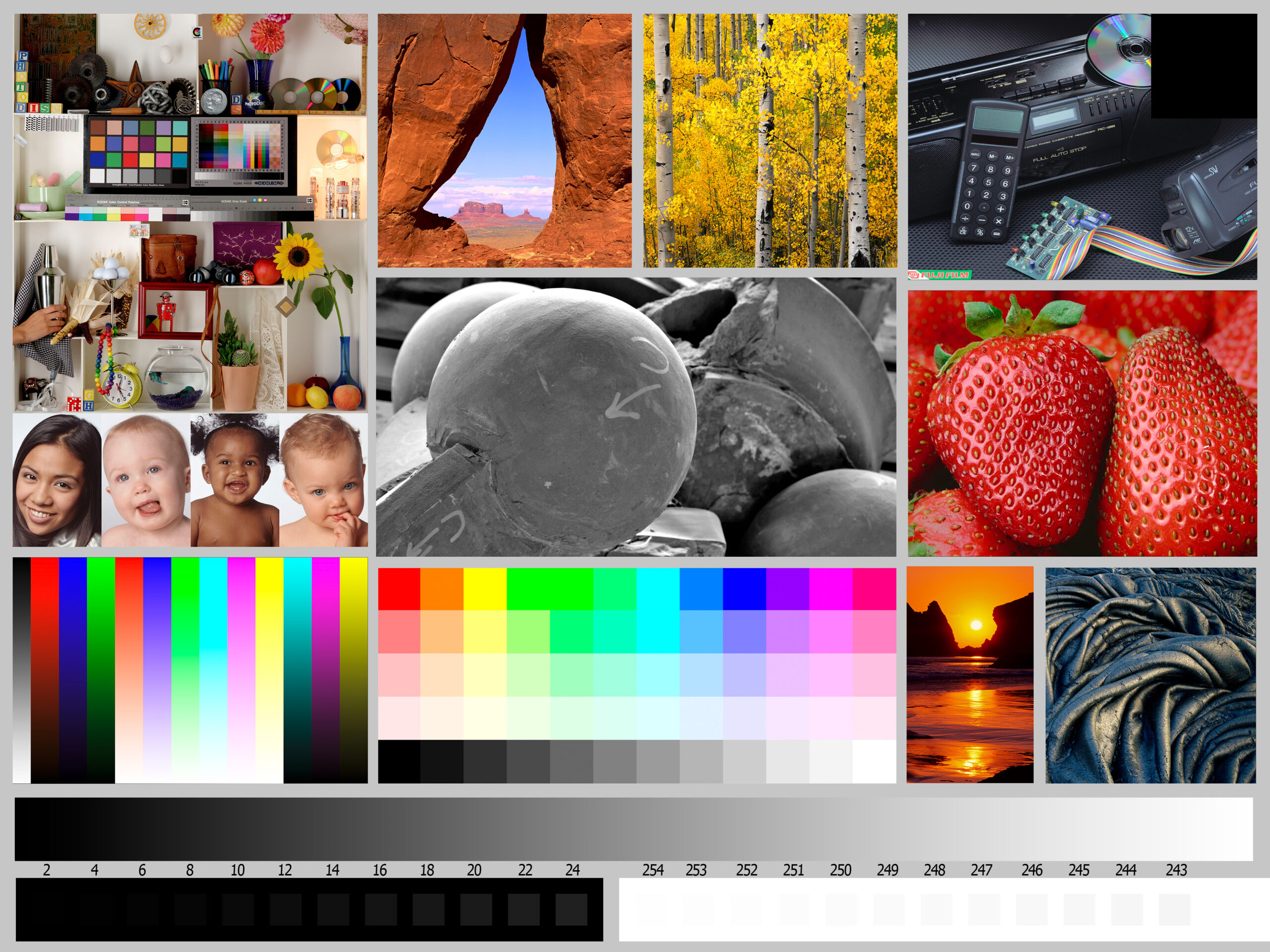

The color space is an excellent match. Unfortunately, the blacks are getting crushed on this printer, giving the prints a magazine look, rather than looking like a real developed photograph. There does not seem to be any option in its driver to increase the ink density. (If you do have the option, try it, and calibrate the photo paper prints again from the start.) To get around this problem, I simply printed over my previous 6 calibration sheets a second time, renaming the previous calibration and running just the scanin, average, and colprof steps again.
Using this new color profile, the output of cctiff, as seen on the screen and after a single print pass, appears much brighter with more contrast range in the dark colors. This is as expected, since the ink will be doubled during the print. The downside of this trick is a reduced sharpness, since the prints are not always perfectly aligned.
The resulting test print looks excellent. From left to right — original file, default photo print settings, photo paper calibration, and the 2-pass photo paper calibration.


After printing twice over on the same sheet of photo paper, using this specially calibrated profile, I can obtain much deeper blacks, without affecting the rest of the color space. The print looks almost like an actual developed photograph, and immensely better than the default settings, so I’m quite happy with this result.

The support team at Brother has given the following response on the blackness of this printer:
Upon consulting with our Technical Team, blank ink will not mix to CMY inks because for DCP-T500W, BK is classified as pigment, CMY is classified as dye. Our latest models are using dye inks and the method of printing is different. The black ink is now also used in photo printing to produce much vibrant dark images.


Hi, would it be better to first scan the blank paper, on which the test is printed, and then white balance the scanned test with the average color of the paper? So the error because of paper color would be avoided?
The printed test grids include white sample points. White balancing is handled properly by the color profile already.
If you use Relative instead of Absolute when printing, display white will become mapped to print white.
Hi, very interesting and useful article, thanks.
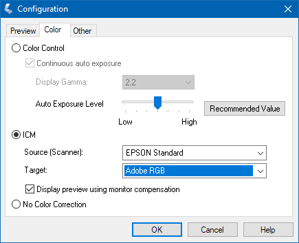
I think the scanning would be more precise if selecting “No Color Correction” and using the specific scanner native color profile; for Epson V39 in windows 10: C:\Windows\System32\spool\drivers\color\PERV39_R.ICC
Yes, that would probably be better. Thanks for the tip, I didn’t spot the profile in there when I was writing this up. I’ll have to run some comparisons. 🙂
After many tests (Canon iX6550 printer and Epson Perfection 2400 Photo), checking the Argyll CMS documentation and other references I think the best options por targen in this context are the default ones (as others already mentioned). I’ve not found any visually apreciable gain with more neutral patches, whites, blacks or different steps distributions, for an A4 sheet with 1040 total color patches.
So my suggestion is a more simple process:
targen -v -d 2 -G -f 1040 printer_scan_profile_A4
printtarg -v -i SS -s -t 150 -R 0 -m 4 -p A4 printer_scan_profile_A4
(-T generates 16bpc tiff; maybe be more precise if the printer driver could do 16bpc)
(Print the file generated, ‘printer_scan_profile_A4.tif’. The printer settings without any color correction, just paper media selected.)
(Scan the whole page, the corners marks should be seen, at 150ppp is enough, tiff format, without any color correction at all. 48bit scanning when supported, although the scanning method is not very colorimetric accurate anyway and then maybe there are no gain in using 48bit vs 24bit.)
scanin -v -dipn -c -a printer_scan_profile_A4_scan.tif printer_scan_profile_A4.cht printer_scan_profile_A4
(in Windows for Epson V39: ~~> “C:\Windows\System32\spool\drivers\color\PERV39_R.ICC”)
(“-dipn” option generates a test image to check the patch reading is correct; check the marks at corners)
colprof -v -D “Describe the profile, paper, settings…” -q h -S sRGB.icm -c mt -d pp -P -r 1.0 printer_scan_profile_A4
(-S should be chosen by the more used one, so sRGB could be more appropiate than larger gamut AdobeRGB1998 if working with sRGB images and monitors; check argyll documentation for the explanation)
With the shown steps, the best results I’ve achieved is by using relative colorimetric conversion with black point compensation. The printed image in photo paper is very similar to what I see in the screen (in my opinion a very good print).
Thanks again for your article!
Good tips. That -dipn switch sounds very useful.
I suppose the settings for the grids depend on the printer and paper used. I actually ended up printing my sheets downscaled on smaller regular photo paper.
The color conversion being relative vs absolute sort of depends on your use case. In my case, one of the things I was trying is to reproduce very close copies of existing old photos, in which case absolute conversion appears to be more appropriate. For printing digitally sourced photos, relative and perceptional modes seem more practical in many cases and will visually appear close as well.
When using the -dipn switch, you also need to put debug output file on the end.
eg “scanin -v -dipn -c -a printer_scan_profile_A4_scan.bmp.tif printer_scan_profile_A4.cht printer_scan_profile_A4 diag.tif”
And the overlaid marks dont match the marks on the scanned paper… what to do in that case? https://i.imgur.com/HrHcPmD.png
I study law and politics and I arrived here for my 15 year old poor color printer, and this article somewhat (or deeply) has given me an interesting perspective of modern politics mechanisms.
Hello ,
I see your websitehttps://blog.kaetemi.be/and its impressive. I wonder if advertising options like guest post, ad content are available on your site?
What’s the price if we want to advertise on your site?
Note : Article must not be any mark as sponsored or advertise.
Cheers
scarlet anderson